If any one person can be credited with having introduced the idea of "high concept"—the single striking image or pithy phrase that immediately sums up a creative work—to the movie industry, it would have to be Saul Bass. Not that the term existed when Bass, then known as one of America's brightest graphic designers, was called in to create the poster and title design for Otto Preminger's Carmen Jones. Bass preferred to talk in terms of Single Appropriate Image, in contrast to the then prevalent style of selling films, which he drily summed up as "the See! See! See! approach. See the missionaries boiled in oil, see the volcano destroy the island, see the virgins of the temple! The theory was that if you talked about a film in pieces, there would be something for everyone." Instead of crassly duplicating the function of the trailer, Bass saw his task as "finding a metaphor for the film, rather than an actuality from it."
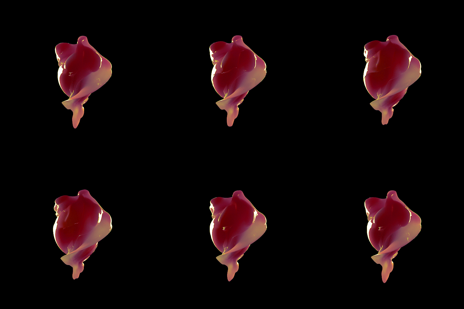
The single image he created for Carmen Jones was a rose, in flames; taken with the title, that said it all. His design for Preminger's next film, The Man with the Golden Arm, was yet more audacious: the jagged diagram of an arm groping downward, contorted with agony. Like so many of Bass's concepts, it relied on the simplest and most effective style of design, a silhouette. Initially Preminger wanted a static image for the title sequence, but after "some towering discussions" Bass won his battle to animate the arm, making it jerk in torment to the rhythm of Elmer Bernstein's doomy, small-hours jazz score. Not for the last time, Bass's title sequence packed a more formidable punch than the movie that followed it. The prowling black alley cat that prefaced Walk on the Wild Side was so patently the best thing in the film that, once word got around, people would come to see the credit sequence, then get up and leave once the film started.
Knowing that nothing is more universally recognizable than stylized images of the human face or body, Bass drew on this primal source for some of his most memorable designs. The paper cut-out doll, suggesting at once childish innocence and the lethal sharpness of a blade, introduced the kidnap drama of Bunny Lake Is Missing. For Exodus, clenched fists grasping at a rifle: anger, desperation, revolt, revenge, all in one charged outline. A voluptuous pair of bare female thighs (in a style borrowed from Matisse) heralded the sophisticated sex comedy Such Good Friends. Bonjour Tristesse was evoked by a made-up face (a nod here to Picasso) decorated with a single fat tear. Most famous of all was the sectioned human body that suggested both a chalked forensic outline on the ground, and the title of the film: Anatomy of a Murder. So potent was the concept that it has been widely plagiarized ever since.


No comments:
Post a Comment